top of page

Logo Design
Reflection:
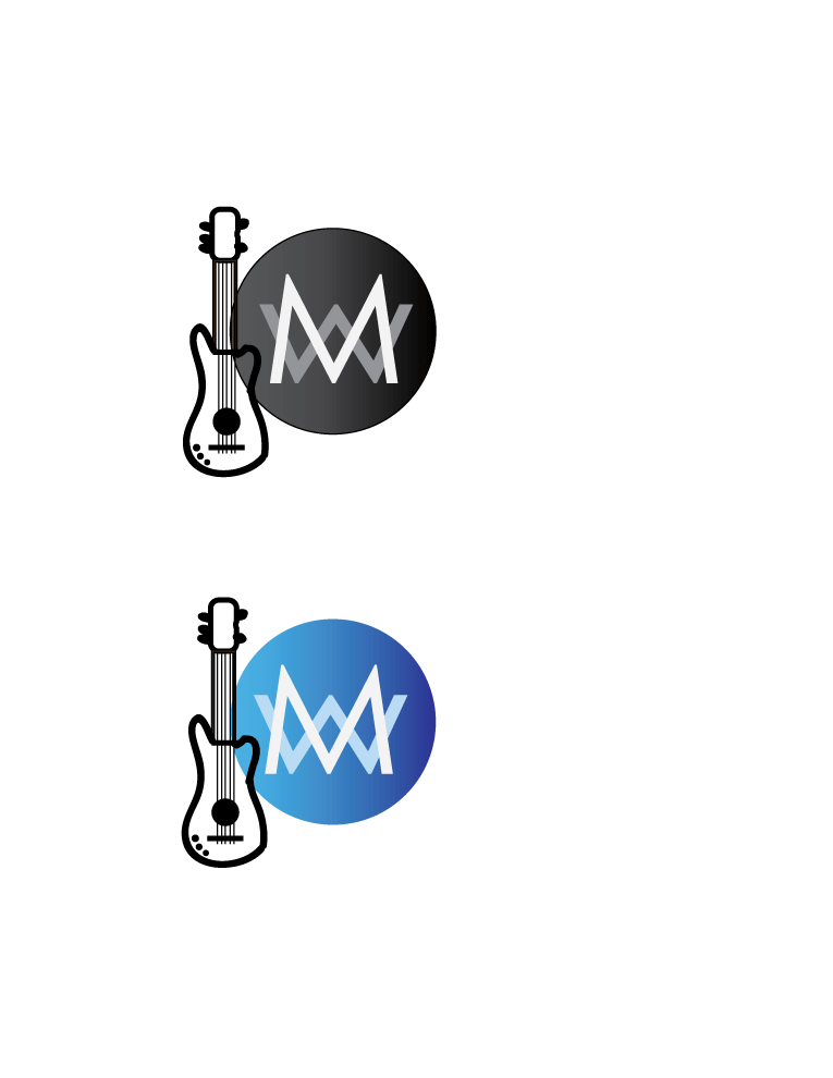
I always would draw my initials if I were to have a logo so I used the design I used a kid. I also used a bass for my graphic because me and my dad bond over playing bass and I love music. My design connects, my initials definitely connect and the bass is attached with it. I think that my logo is balanced nothing is too overpowering. I like this combination because I tried putting the bass on the other side but it didn't look right. I used my font because it looks neat and tidy, and when you stretch it out like I did it doesn't distort the letters it still keeps the same font. My color palate is blue and white because those two colors look really good with each other and it's appealing to my eyes.
bottom of page